TL;DR — XWord Info is changing the way it presents some grids that contain special graphical overlays. It’s probably better. Probably.
Some history
For many years, NYT supplied their paying customers with crosswords in a format that could be consumed by an application called Across Lite. It had a simple user interface that was particularly loved by speed solvers, and it was the standard way that publishers delivered crosswords. It could do simple rebus tricks, it knew about circles in the grid, and even some accented characters in case you wanted to include a word like résumé in your clue. Users loved it.
NYT stopped publishing in that format in 2022.
Huh? Why?
For business reasons you won’t like
By the time NYT understood that crosswords were becoming more important to their business, they also realized they were leaving money on the table. A separate Across Lite file was too easy to share with your non-paying friends.
More importantly, using Across Lite took you away from their website, where they’d like to show you ads, and encourage you to try other games, maybe even read a news article, if that’s your thing.
But also for creativity reasons you will like
The limited gimmicks that Across Lite supports was proving to be too restrictive for modern puzzles. You couldn’t have shaded squares. Colors in the grid weren’t allowed. The lack of Unicode support1 meant that most foreign languages could not be represented in the clues.
By moving crossword solving to their proprietary webpage, NYT could do whatever they wanted. Suddenly both shades and circles could appear in the same grid. Color, at least on Sundays, was possible. Clues could be written in Thai or Navajo, or they could even be pictures.
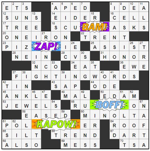
And (here we get to the point of this post), there could even be graphical images superimposed on the grid like you see in the image above.
Graphics in XWord Info
NYT and XWord Info use different methods for rendering the grids on the page2. In the past, XWord Info has tried to simulate NYT images using HTML, mostly with success. But if your grid has a twisty vine winding down the center, a better solution is needed.
So now, in those extreme cases, XWord Info combines its and NYT’s methods. Most browsers support that now.
A few examples
And here’s the complete history.
The future of NYT graphics
Will NYT continue to innovate with graphics in the grid? I have no idea. There’s a cost — not just work for graphic artists and website programmers, but also the hidden cost of dealing with syndication partners who can’t handle the color or graphics.
So, maybe it’s a flash in the pan, or maybe we’re on the verge of exciting new possibilities. Animations? Sound? 3-D? Who knows?
Time will tell.
Technical footnotes
- Across Lite supports the ANSI character set meaning only basic French, German, Spanish, Italian, etc. could be rendered. Unicode covers nearly every known language, past and present.
- XWord Info uses HTML tables to display the grids. Graphics have been added in the past using HTML canvas. NYT uses Scalable Vector Graphics (SVG.) Click the the thumbnails here to see some fancy canvas animations.
